We’ve all been there. You finally get an LED neon sign you love, you’re excited to put it up… and then you look at your wall and suddenly feel a bit stuck.
It’s just there. Blank. Waiting for something to happen.
And somehow, what looked effortless on Pinterest now feels like a full interior design project.
The truth is, styling a neon sign isn’t about copying what you’ve seen online. It’s about understanding your space and making choices that feel right for you. Because your home has its own identity, its own mood, its own personality.
And once you tap into that, everything starts to make sense.
The first thing to think about is your overall style. Not in a complicated way, just a simple question: what kind of space do I actually want to come home to?
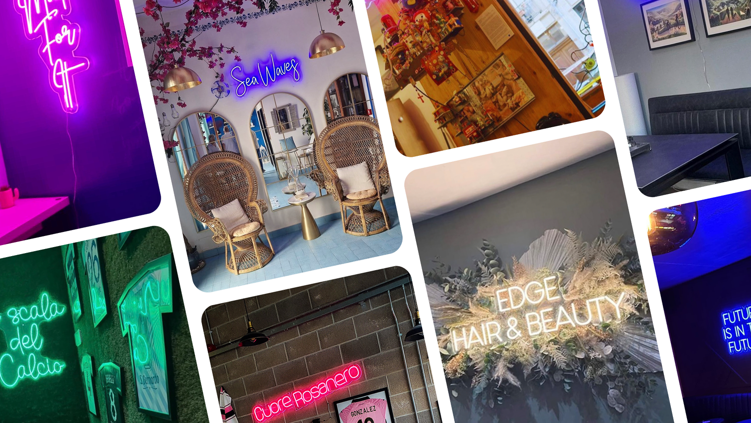
Some people naturally lean towards a minimalist look, with clean lines and neutral tones. Others prefer something softer and more layered, like a boho style with textures and warmth. You might like a more modern feel, or something slightly industrial with darker tones and contrast. And sometimes, it’s not just one style, it’s a mix. A bit of minimalism with a touch of boho, for example.
 |
 |
 |
 |
|
Style: Minimalist/
Modern |
Style: Industrial/
Themed |
Style: Boho/
Coastal |
Style: Modern Boho/
Contemporary |
There’s no right or wrong here. The goal is just to be intentional.
Once you have that in mind, everything else becomes easier, especially when it comes to placing your neon sign.
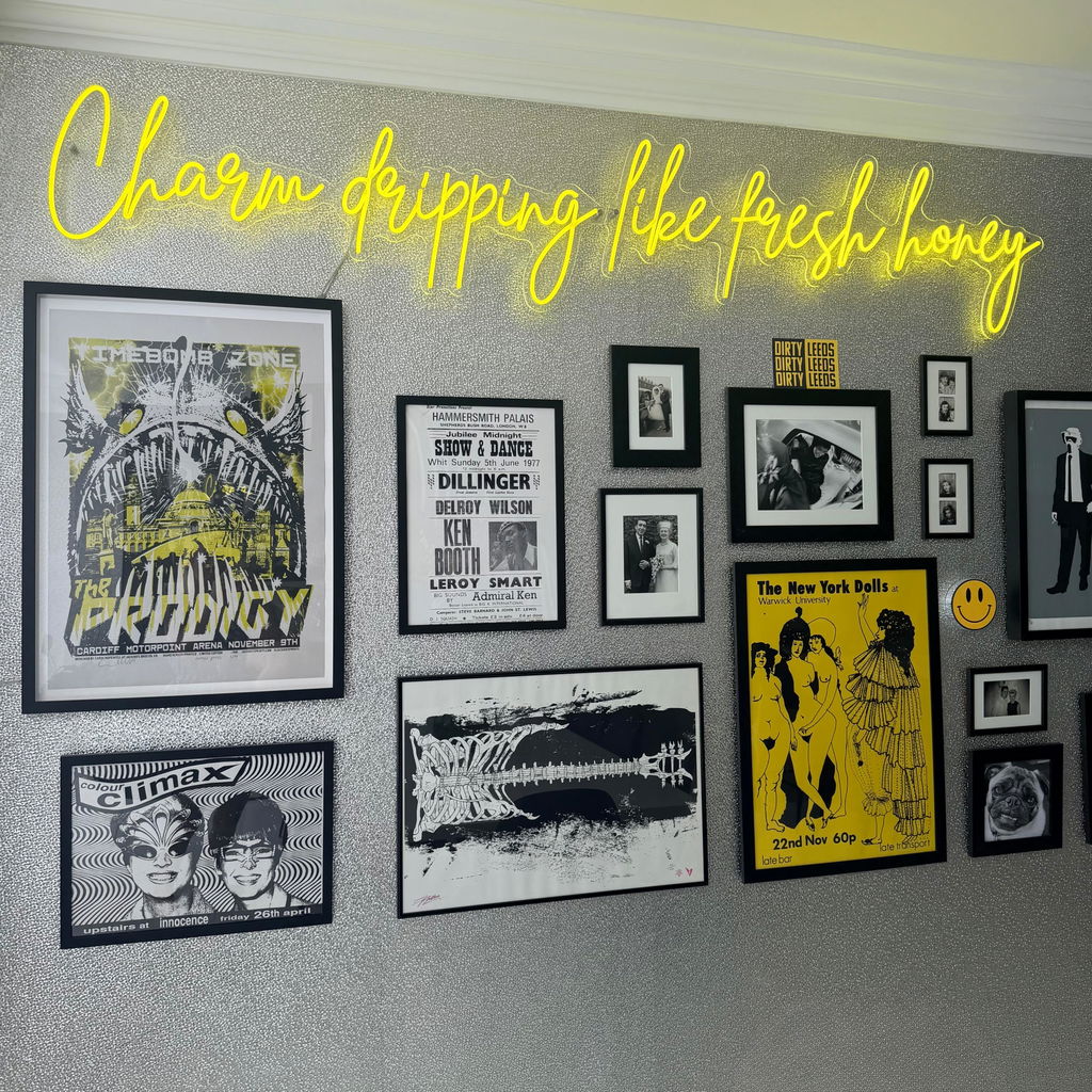
One thing that makes a huge difference, and that people often overlook, is balance. Not everything needs to match perfectly, but everything should feel like it belongs in the same space. A neon sign shouldn’t feel like something randomly added at the end. It should feel like part of the room.
That’s where things like scale and placement come in. A small sign on a large empty wall can feel a bit lost, while something too big in a tight space can feel overwhelming. It’s about finding that middle ground where the sign feels like a natural focal point.
The same goes for spacing. It’s tempting to fill every empty area, but leaving some breathing room, what designers call “negative space”, is actually what makes a room look more put together. Sometimes doing less really does look better.
Colour plays a big role as well. A simple way to think about it is through the 60-30-10 rule that designers often use. Around 60% of your space is your main colour, usually your walls and larger furniture. Then 30% is your secondary colour, things like rugs, bedding or curtains. And the final 10% is where your accents come in, smaller details that bring everything together. That’s exactly where a neon sign sits.
If your room is quite neutral, your neon sign can be the statement piece that adds personality. If your space already has a lot of colour, then it’s better to choose a neon that complements what’s already there, rather than competing with it.
When it comes to actually styling your neon sign, it helps to think in simple setups.
Above a bed is one of the most popular options. It works because it naturally draws the eye, and it doesn’t require much else. Keep your bedding fairly simple, maybe add a couple of cushions, and let the sign do the work.
In a living room, a neon sign can sit really nicely as part of a feature wall. Pairing it with a few framed prints or artwork can make it feel more complete, but the key is not to overcrowd it. A bit of structure goes a long way.
If you have a vanity or makeup area, neon works beautifully there too. The glow reflects off mirrors in a really flattering way and instantly makes the space feel more put together — especially if you’re creating content.
Even in a workspace, a simple neon sign can shift the whole mood. Whether it’s a small quote or something more minimal, it adds that bit of personality that makes the space feel less functional and more yours.
Of course, there are a few common mistakes that are easy to make.
Hanging a sign too high is probably the biggest one. It disconnects it from the rest of the space. Another is choosing a size that doesn’t suit the wall. Either too small to stand out or too big for the room. Mixing too many colours can also make things feel chaotic rather than styled. And lighting is often ignored, but it matters. A harsh white light combined with neon can completely change the feel of a room.
If there’s one thing to keep in mind through all of this, it’s that styling doesn’t have to be complicated. Most of the time, it’s about simplifying rather than adding more.
A well-placed neon sign, with the right balance around it, can completely transform a space. It turns an empty wall into something that feels considered. Personal. Finished.
And that’s really what people are trying to achieve when they save all those Pinterest photos in the first place.
At Planet Neon, that’s exactly what we aim to help with: creating LED neon signs that don’t just light up a room, but actually become part of it.
Leave a comment
This site is protected by hCaptcha and the hCaptcha Privacy Policy and Terms of Service apply.